
Blog · · AuraNexas Web Team
Small Business Branding Basics: More Than a Logo
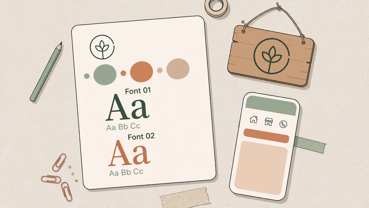
Branding for a small business is the whole impression customers get — your name, logo, colours, fonts, and the way you answer a message — kept the same everywhere they meet you. A logo alone makes you recognisable; consistency is what makes you trusted. Start with a one-page brand sheet, not a sixty-page manual.
Most small businesses do not have a brand problem. They have a consistency problem: the logo is stretched on the banner, a different green on the menu, squeezed into the corner of an invoice. Each one on its own is small. Together they make a business look less established than it is.
This guide covers what branding actually is, what goes on a one-page brand sheet, how many colours and fonts you need, and how to roll it out without spending a fortune. The American Marketing Association's definition is the anchor: a brand is the features that set one seller apart from another.
What is branding, and what is it not?
A logo is the symbol that identifies your business. A brand identity is the complete system around it: logo, colours, fonts, imagery, tone of voice, and usage rules that make your business look and sound the same everywhere customers meet it. A logo makes you recognisable and nothing more — it cannot make somebody want what you sell, and it cannot fix a price that is wrong.
Branding is the whole set of things a customer uses to decide whether to trust you: the name, the colours, the typeface, the photography, the way you answer a message, and above all whether those stay consistent from one encounter to the next. Answer four questions before any design: who the customer is, what they believe, what competitors look like, and what you want them to think.
What goes on a one-page brand sheet?
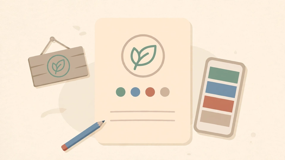
Your logo files and where each version is used, your colour codes written as HEX values, your two fonts and what each is for, and a list of do-and-do-not rules with a logo size. That page is the reference your staff, printer, and designer use, so the business looks the same on a sign, a receipt, and a phone screen.
- Logo versions — three, not six. The full logo, an icon, and a black-and-white version, each with a minimum size it can be used at.
- Colours with exact codes. HEX for screens, and a print note. Record the code, not the colour name — "green" is not a code.
- Fonts — two at most. One for headings, one for everything else, both available to whoever makes your posts next year.
- A few don'ts, shown as pictures. The logo stretched, recoloured, rotated, or on a busy photo — six to eight common mistakes with a cross through each.
How many colours and fonts do you need?
Three colours and two fonts are enough for most businesses: one main colour, one supporting colour, and one accent saved for buttons and the logo, with a 60-30-10 balance across a page. Fewer choices are easier to apply consistently, and consistency is the point — a font on every poster is not a brand, it is a pile of posters.
Two practical checks before you commit. First, contrast: readable text needs a contrast ratio of at least 4.5 to 1, and bright brand colours often fail as text — a bright green on a light background can score as low as 1.3 to 1. Second, reproduction: test colours and type everywhere they will appear, including a photocopy, a profile picture, and a cheap phone screen in sunlight.
Roll it out in the right order: strategy first, then logo, colours and fonts, then a consistent rollout across your website, Google Business Profile, social profiles, WhatsApp, invoices, and signage. Brand the free touchpoints before spending big — a consistent profile and WhatsApp presence cost nothing and are seen daily. Review the brand once a year and refine it as the business grows, rather than changing it on a whim.
AuraNexas builds brands and the websites that carry them. If your logo is fine but everything around it disagrees, visit AuraNexas and bring your current flyer, sign, and social profile — the fix is usually a one-page sheet, not a new logo.
Want help with this?
AuraNexas builds AI automation, chatbots, websites, branding, and lead generation for small businesses. Tell us the one job in this guide that costs your team the most time, and we will scope it with you — no obligation, no invented promises.
Frequently asked questions
- Is branding just a logo?
- No. A logo makes you recognisable; branding is the whole system — name, colours, fonts, tone, and the experience of dealing with you — kept the same everywhere.
- How many colours should a small business use?
- Three colours and two fonts are enough: one main colour, one supporting colour, and one accent for buttons and the logo, roughly 60-30-10 across a page.
- Do I need a brand guide?
- A one-page brand sheet is enough for most small businesses: logo files, colour codes, fonts, and a few do-and-do-not rules. It keeps staff, printer, and designer consistent.
About the author
AuraNexas Web Team — Web Lead, final-year BSc (Hons.) Agriculture student, The Islamia University of Bahawalpur (IUB). AuraNexas is a digital agency offering AI automation, chatbots and SaaS, web and app development, branding and UI/UX, lead generation, ads and cold email, AI UGC and video sales letters, e-commerce, and virtual assistance. Team: Web Lead (owner/CEO), Muhammad Waseem (AI automation), Ali Hasnain (AEO/GEO). No client results, testimonials, or revenue figures are claimed in this article.
Sources
- Tadal Studio, "Simple brand guide for small business: what to include" — A useful brand guide covers 5 things; 60-30-10 colour balance; readable text needs at least 4.5:1 contrast. Opened via search 17 Nov 2026.
- iType Design, "Branding for Small Businesses: A Beginner's Guide 2026" — Branding as consistency in look, sound and feel; one primary colour plus one or two supporting colours; no more than two fonts. Opened via search 17 Nov 2026.
- Frank Deardurff, "The Brand Message Playbook" — Colour meanings vary by culture; 60-30-10 rule; record HEX, RGB and CMYK; text needs at least 4.5:1 contrast. Opened via search 17 Nov 2026.