
Studio concepts/Premium e-commerce
Atelier Vale
A storefront for a fictional maker of quiet furniture and objects: grid, product page, basket, mobile browsing and checkout.
A fictional brief designed by the studio to show the work. It is not a client project and makes no claims about results.
01The brief
Expensive objects need room to breathe.
Atelier Vale is an imagined studio selling a small range of furniture and lighting. The brief: a shop that feels like walking through a showroom—large calm imagery, honest materials, clear prices—while still making it effortless to choose a finish and buy.
02Product grid & page
Choose an object. Choose its finish.
Pick a product, change the finish and quantity, and add it to the basket. The price, lead time and basket total update as you go.
Atelier Vale
Collection · 5 objects
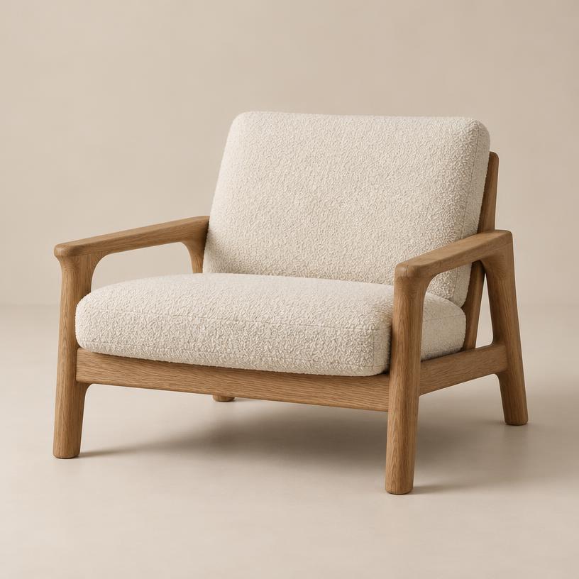
Lounge chair
Lowe Chair
Solid oiled oak frame, removable bouclé cushions, a low and generous seat.
£1,180
Made to order · 6 weeks
Basket0 items
Nothing yet. Choose a finish and add an object.
Subtotal£0
03Mobile browsing
The same shop at thumb size.
On a phone the grid becomes a swipeable rail and the basket sits within reach. This is the same data rendered at a 390px viewport.
Atelier Vale
Swipe the collection

Orb Lamp
£240 · Travertine
Lowe Chair
£1,180 · Oiled oak
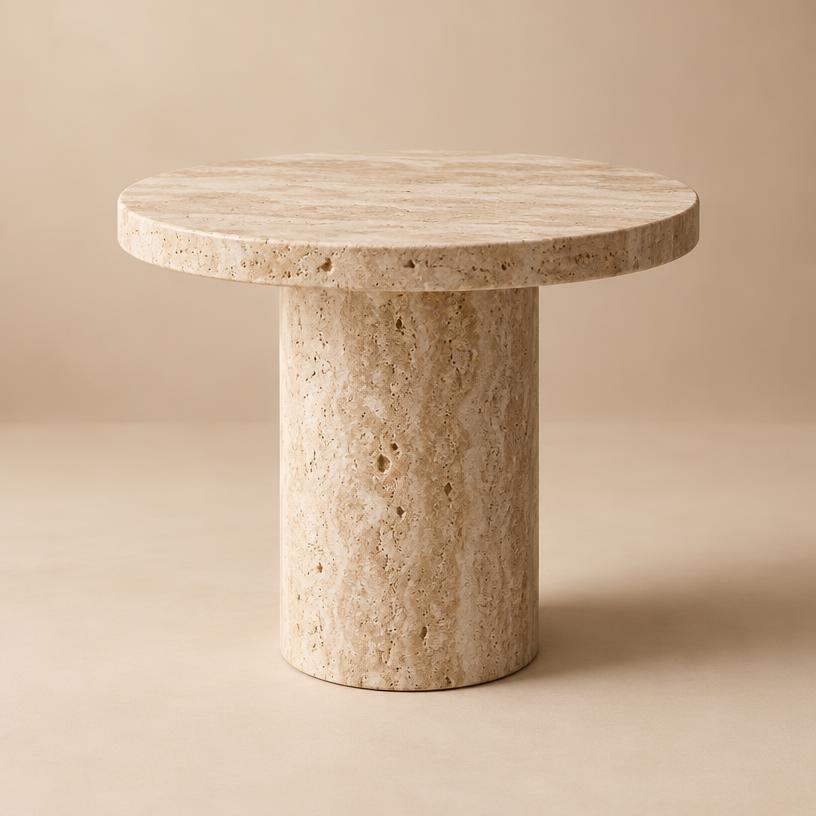
Column Side Table
£690 · Honed

Halo Vase
£120 · Sage glaze

Pebble Bookend
£95 · Chalk
44px+ touch targets
Every button in the phone view is at least 44px tall, so it can be hit with a thumb.
One basket
The phone and desktop views above share the same basket—add here and the desktop subtotal changes.
Swipe, don't pinch
The grid becomes a snap-scrolling rail, so nobody has to zoom to see a product.
04Checkout concept
Three steps, no surprises.
Delivery, details and review. Costs are shown before payment, never added on the last screen.
- 1. Delivery
- 2. Details
- 3. Review
Subtotal£0
Delivery£0
Total£0
Prices are illustrative. No payment is taken.
05Art direction & performance
How it's built to feel fast.
Decisions behind the interface: typography, imagery, and what keeps the page quick on a mid-range phone.
Serif for names, sans for facts
Product names carry the voice; prices, finishes and lead times stay in the interface face so they scan quickly.
Prices never hide
Price and lead time sit next to the finish switch and update with it.
What this demo shows
What's simulated
Sample products and prices in your browser. There is no stock system or payment provider, and the checkout never takes payment.
Disciplines it demonstrates
- Web & Software Development — Responsive storefront and interface architecture
- E-commerce — Product selection, product page and basket
- UI/UX & Product Design — Mobile browsing and checkout states
Want something like it?
Tell us what you'd want it to do.
We'll fill in the relevant services on the Contact form for you. You check them, add your details and send when you're ready.
Other studio concepts
AI lead operations
Pinecrest Enquiry Desk
An enquiry desk for a fictional property agency: every message is captured, qualified, tagged and handed to the right agent.
Video & content
FRAME/SHIFT
The studio's own raw footage against its finished edit, with the timeline, crops and content pipeline behind it.
Brand identity
Morrow Studio
An identity system for a fictional ceramics studio: mark, wordmark, spacing, pattern, stationery, packaging and a landing preview.
Growth & commerce
SignalCart Journey
One customer journey drawn end to end: ad, landing page, follow-up email, product, checkout and the dashboard that measures it.